
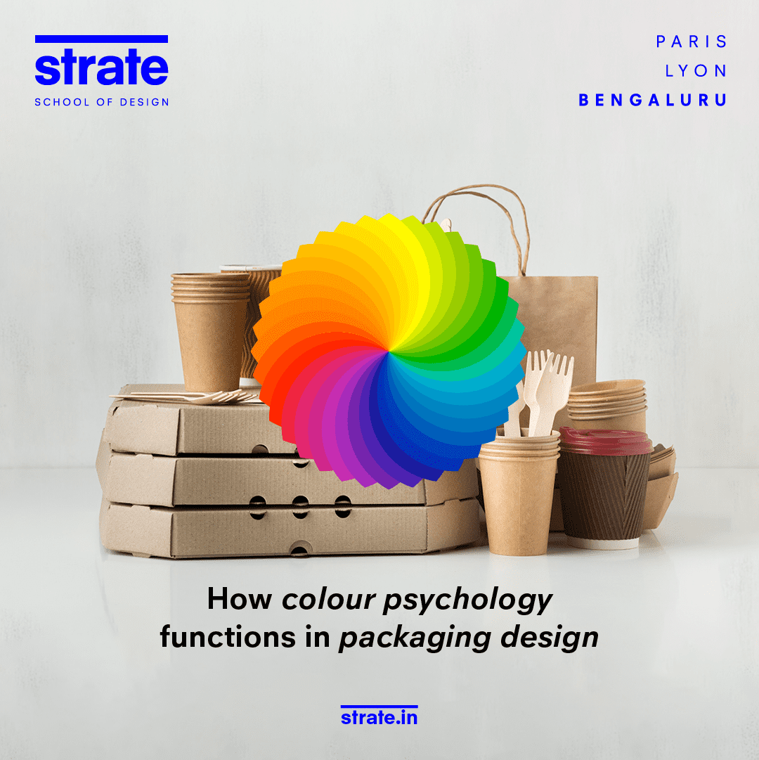
Colours serve as a powerful tool to captivate eyeballs of the consumers, bring out emotions and influence consumers purchasing decisions. Colour psychology is key for designers to build a design that stands out amidst the competition and is also able to establish a profound connection with their target consumers.
Colours hold powerful meanings and message hence possess the ability to communicate a certain context to evoke specific feelings in consumers. Designers must understand how different colours are perceived and what they mean in different regions and cultures. With this understanding, they can make strategic design decisions to use colours that align with brand identity as well as effectively communicates the intended message of the product.
Read here: Most popular chatGPT AI prompts for designers
Colours and its associations…
Power of different colours
– In design world the colour Red is generally associated with passion, urgency, excitement and is ideal to be used for F&B packaging as it helps simulate appetite.
– Blue is know for symbolising trust and reliability. It is used widely across healthcare and financial service providers in their brand identity design. Helps them to portray a sense of calmness and reliability among their customers.
– Green colour is known for its connection with nature, sustainability, and freshness. You will see this colour being used widely by eco-friendly, natural, and organic products in their branding.
Colour Combination
– A combo of colours red and orange falls under a warm colour combo palette and is known for evoking a sense of energy and enthusiasm. It is ideal for products that want to give out a vibrant and youthful vibe.
– A cool colour combo would be a mix of blue and green that brings out the message of harmony and tranquillity. It is well suited for brands to create a sense of calmness and relaxation.
Also read: What a career in metaverse and NFT design can offer
A mindful and careful selection of these colours in packaging design can help to enhance brand messaging that resonates with its audience and brings our desired emotions.
Example
Frooti
is a popular Indian fruit-based drink brand that makes use of a bright yellow and green colours in its packaging design that creates a visually appealing colour scheme reflecting the freshness of their product.
Paper boat
uses vibrant and eye-catching colour combos that are inspired by Indian patterns and motifs to attract consumers to their unique and visually appealing packaging design.
Cultural and regional associations
Each colour represents its own story; in our folklore we will find stories that associate red with an auspicious occasion while in another culture it may not be considered a significant colour.
Colours have different cultural context in our diverse world.
In eastern countries, more so in Asian countries like India, white is associated with mourning while in the western part of the world white is considered auspicious for weddings.
Also read: Designing for the future with tech: How AR/VR is the future of UX/UI
Designers must understand who they are designing are for and take into consideration their cultural nuances.
Colour contrast and Placement Hierarchy
Using different colours brings in the question of what goes first, before, or right beneath. The hierarchy helps the user eye to navigate through the packaging. Designers can help them with design tactics to read through and highlight key information that is important for them to make the purchasing decision.
Designers can make use of contrasting colours in packaging design to draw in the attention of the users to vital elements like the product name and its key features. The visual hierarchy helps to guide consumers’ focus and facilitate a seamless browsing and purchasing experience.
Also read: Amul Girl: Longest running and successful ad mascot
Example:
Coca cola
uses a classic red and white colour scheme that builds a high contrast ensuring easy visibility of their branding elements on their packaging, making it instantly recognizable.
McDonald’s
makes use of yellow and red colour combo to leverage the high contrast of the two colours and attract attention facilitating quick recognition.
Minimalistic packaging design
Minimalism in packaging is when brands make use of colours like plain black, white, royal blue to reflect a sense of elegance and delicacy. The type is generally keto simple to attract the attention on the small details to make it catchy and memorable for the users.
Example:
Apple
is known to use minimalist packaging design that showcase the brands simplicity, elegance while they work with clean lines and use of minimal text and graphics.
Raw Pressery
is an Indian cold-pressed juice brand that uses minimalistic packaging design with clean type, a minimal colour palette – bringing out the purity and freshness of their products.
Keen to learn more on how colour psychology is a fundamental aspect of effective packaging design?
Join Strate School of Design’s Brand Identity and Visual Communication programme and learn more on what different homegrown and global brands are doing with their brand colours to evoke emotions and convey the brand message. Become an expert on the colour psychology with Strate.
Want to Become a Designer ?
Strate is a unique design school that nurtures your talents as a designer by offering state-of-the art designing courses in Bangalore.
Join Strate