
Spotify’s Wrapped is one explosion of colour, design aesthetics and marketing genius wrapped into one that unfolds on your devices to capture your mood of the entire year – the way you danced, swayed, connected, explored, and engaged with music. It’s that one activity from the global entertainment brand that brings you closer to yourself, makes you nostalgic of how many times you were taken aback by a certain song, band or just those moments of peace.
Why is it a design sensation?
Each year, they have an existing theme, and it only gets better. If marketing and design could be defined in one sentence – Spotify’s wrapped would be in the top 5 runners. Why?
A. It is personalized designs with unique colour combinations.
B. It is typography with striking and impressive appeal, appealing to your emotions.
C. Data is king – Yes! Design is one part of it, another part of it using data to bring you your musical theme of the year.
D. It’s fun, easy-to-consume, with bright and jolly energy and so easy to share with your friends over socials.
Also interesting to read: Humanity Centric design and why it matters
What really happens?
If you are new to this, let’s get you prepped for this.
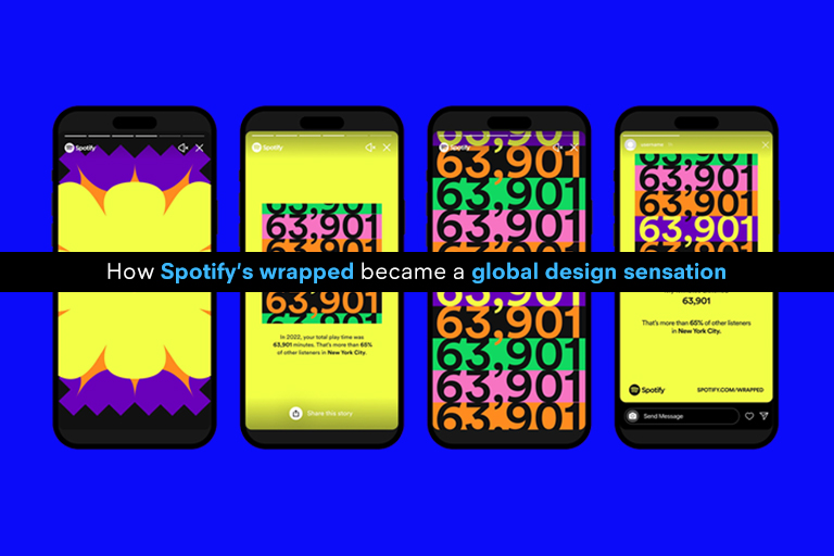
Every year end, Spotify does this wonderful campaign on its application where you can see the analysis of your entire year’s music you have listened to. It’s a crisp campaign that flows like an Instagram story – each page with animated features and dynamic storyline, all of which can be shared on social with one click button option- but it’s personalized for each user based on data.
This data is what you listen to, how many times, what artists are your top favourites, what song is your go to, how many genres did you explore, are you more into classics or have a quirky taste platelet, are you more of the day listener or night time music binge person – anything to everything – they have date for each category, and a design for each category.
Also interesting to read: Trends shaping the future of automotive design
Key elements of Wrapped branding:
1. Wrapped uses the brand elements in their strategy:
What does this mean?
Wrapped each year is an original work with skilfully curated elements representing the brand’s energy and vibe. Each story is like a billboard article with their top lists of the month and year- almost, yet so much more personalized. It will give you your Top 5 artists of the year, Top songs of the year – it’s like you as a listener are giving these titles to the artist – isn’t that something now?
It’s an element of surprise, newness and originality that keeps the user glued – that also bring out Spotify’s unique characteristics.
2. Wrapped personalizes it:
Their designs are based on categories and categories are based on data. The way they go deep into their design process to personalize elements reflects how seriously they take this campaign. Using the brand’s core strategy, they work to tell its users their own stories and keep you interested till the very end – which is a winner.
They know which songs you loved the most, which new artists you explored, which was the dominant genre for you this year, how many minutes you spent listening to songs on Spotify, which song you fell in love with and bring you all this in a curated manner.
Also interesting to read: Natural Cooling- The rise of terracotta designs
3. Wrapped is enjoyable
Well, if visual communication that is personalized is also enjoyable – we got a winner!
Their design elements are carefully put together to make sure there is an element of surprise – before they reveal to you what your most listened song of the year was and how many times you listened to it – there is a backstory with design leading to that. The wait, the curiosity, and the hype – it’s all worth it when more than the results the user is also enjoying the whole process.
Did we mention, each story has its own background music – all representing your most listened to songs, so you are sure to enjoy the process.
4.Wrapped design comes in all shapes and sizes
When you look at these Wrapped stories – you realize how they have carefully, mindfully, and aesthetically curated design elements that stand out. They are designed keeping the theme in mind. From the background hues – representing bright and pop colours that reflect the brands energy to using various shapes, patterns, and sizes to help build each page up as powerful and impactful to increase your recall of what you went through the year – they have it all figured out.
It’s this design in various forms, patterns and shapes that makes each story different, and users seem to love how each page is a different expression of their own personalities.
5.Wrapped main ingredient: You and your music
Let’s not get carried away with the great designs and personalization – the main ingredient here is you and your music. The user, essentially. A great design is what brings the user back to the centre. It’s your data that they make use of to bring you how the year went by for you.
The end of the story for 2022 brought to the users their personality type based on how they explored, artists they listened to and more. They bind you in with a personality type, like ‘The Nomad’ – ENLU, which means Exploration, Newness, Loyalty, Uniqueness – as the main traits.
Each user gets their own personality type, that’s the essence of building a connection with the user.
Also interesting to read: Apple Electric car project: What to expect from its design
6. Wrapped is easy to share
Each story is a marketing genius- they are evolving stories that are presented with a share sign at the bottom so you can pick your choice of digital channel to share your music journey of the year on. If it’s not a share sign – it can add to your library sign – so you can save all the best listens of 2022 into one playlist and playlists are also shareable with your friends and family.
Their narrative with this campaign is simple, echoing the various moods your listened to music represents. What they are rather smartly doing is building a unique customer connection – connecting with their emotions, connecting with their memories associated with music and allowing everyone to feel their unique personalities. They have very successfully defined how the brand values their users, their people, and the culture overall with simple and clean campaign globally. For 2022 – what was more unique was how they went further ahead to assign values for the categories of songs the user listened to – helping the user to understand what mood they were in possibly.
If branding and visual design or visual communication is your skillset and area of work or interest- then this is one case study, you surely cannot miss. If you are curious to be part of the creative teams that work behind these successful campaigns – we encourage you to explore the course in Visual Communication and Brand Identity Design at Strate where you get to learn from industry experts and have global mobility opportunities.
Also interesting to read: How product design is re-shaping experiences for the visually imparied
Applications are now open for 2023 at Strate School of Design, Bengaluru.
Want to Become a Designer ?
Strate is a unique design school that nurtures your talents as a designer by offering state-of-the art designing courses in Bangalore.
Join Strate