
Known for its ever-so-unique design covers, The New Yorker is a weekly American Magazine started in 1925. The journalistic magazine offers literary pieces, commentary, essays, satire and cartoons, and poetry amongst other attributes. One of its most iconic aspects over the past century has been its exclusively designed covers. It’s almost hard to miss a New Yorker cover.
Why are the Covers of The New Yorkers Magazine Iconic?
Designers and artists are known to have distinctive points of view on global and popular culture news. For decades, The New Yorker magazine has utilized this skill of artists and designers to make journalism engaging and immersive.
The magazine celebrates a distinctive point of view of designers that brings a social message in the form of art. The magazine’s journalism focuses on a unique form of storytelling that engages the reader. Working with strong visuals that immerse a reader in the literature. These visuals offer comical relief, bring out global issues in the form of satire, and offer commentary on the economic or social-political environment.
These covers have found homes across the globe as keepsakes in the form of postcards, posters, wall frames, and artworks. The New Yorker is a globally well-known magazine that represents a sense of sophistication. They now also have a shop section that sells cover and cartoon frames along with t-shirts, caps, notebooks, sweatshirts, sleeping masks, etc. All product designs make use of the iconic covers of the magazine over the years. These have become great souvenirs for New Yorkers, and tourists and gifts for people who enjoy a well-designed product.
The Visual Design Language of the New Yorker Magazine
The magazine’s initial year focused on building and sharing a storyline for New York City’s offerings. Its cultural and social life along with its amusements. The later years brought a more structured approach. They became a sophisticated blend of journalist reports and designed storytelling. Today, the magazine targets a well-educated and liberal audience with its;
a. global coverage and foreign reports on building stories,
b. reviews on cinema, theatre, books, and other arts,
c. short fiction stories, essays, and biographical studies,
d. poetry, satire stories in the form of comics and more.
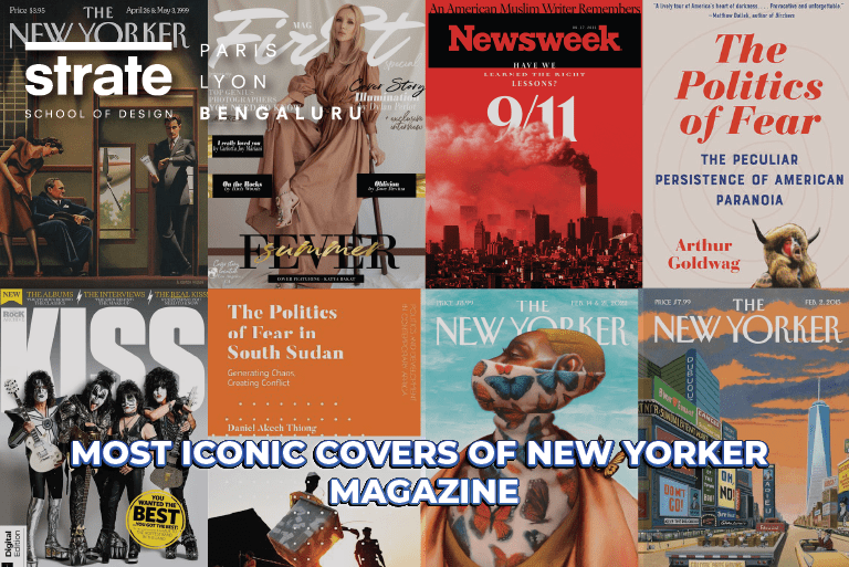
Top 5 Famous New Yorker Covers
Let’s take a walk down some of the most iconic covers of The New Yorker Magazine. Covers that can inspire young designers, design students, and design professionals at large to have their unique points of view.
1. The First Cover
Sure, a famous and iconic one would be the first cover by the magazine’s first art editor, Rea Irvin. Published in 1925, the year the magazine started with its most memorable iconic font. The dandy cover features an artist’s viewpoint of a man, a side profile of him.
This artist’s drawing became a center of talk point in the city. Later the magazine named the character drawn in the first covers as Eustace Tilley. Many critics have long pondered why the art cover was focused on the profile of a man. Was it a joke that readers would connect with, an occupied and sophisticated reader of the magazine, or just the interpretation of the artist for the times?
Irrespective of the multiple translations made from the cover, it stands as a strong symbol for the magazine. A symbol and character that has been time and again recreated by multiple other artists over the decades.
2. New Yorkistan cover, 2001
New Yorkistan was by designed Maria Kalman and Rick Meyerowitz. This cover is about an iconic map of New York City. The designer goes on to explain to the magazine how this is the time war against the Taliban had begun in Afghanistan.
The designer duo was traveling across the Bronx in deep conversation about the political divide in their country, the city, and the global happenings. Their conversation led them to imagine the Bronx city as Bronxistan and came to around 100 names in the day. Finally agreeing upon the idea for the cover of the magazine as New Yorkistan.
The name was used to design the cover to display a fictional city of New Yorkistan with many cultural humors names of areas. It’s known that the magazine for that week was sold out of the stands in just a few days. It has been one of the most critically liked covers.
3. 9/11 Cover, 2001
Designed by Art Spiegelman and Francoise Mouly. Francoise had been the art editor of the magazine for years and her husband, Art, is a well-known cartoonist.
When reflecting on the design, they decided to pay homage to the unbearable loss the city and world saw unfolding on 9-11. The all-black cover was a decision to symbolize the dark act of terror for the city. The tall leading towers of the city had disappeared in a matter of minutes. And the designer duo represented them with just an outline of the two towers, black on black. It was designed to reflect the tower’s absence and the fear of the reality in the city.
4. The Politics of Fear Cover, 2008
One of the most controversial covers for the New Yorker magazine was during the election campaign season of 2008. This was when Obama was campaigning widely across the country and many rumours were spreading. About him, and his wife Michelle, who they are, connecting them with animals like Black Panther and calling them names.
The designer Barry Blitt says that he started scribbling all the whispered, grapevine comments and commentary on Obama and Michelle onto a design sketch. What came out from the designer was a satire piece, one that would make people think how ridiculous the portrait of the couple was. Or so he hoped. He assumed it would be taken as satire and humour.
The sketch shows Michelle carrying a gun on her back posed as a fictional black panther, a burning American flag, and a portrait of Osama bin Laden on the wall of what was seen as the Oval Office.
The cover received a huge pushback from the Obama and McCain campaigns calling it tasteless. Even The Daily Show featured the cover to make a point about how the cover was meant for satire.
5. The Kiss Cover, 1993
Art Spiegelman designed this rather controversial and much-spoken-about cover in 1993. He designed the cover showcasing a Hasidic man and a black woman kissing. To highlight the tension between the two groups in Crown Heights. He mentioned that he knew it would get the attention of the people to sit and think. He works with strong visual elements in his design and wants people to recognize those elements to evoke emotions in them. He wanted the people to understand how communities can be one, humanity. Not divided over the universal love.
Current New Yorker Cover
Have you seen the latest cover for the month of December and the festive inspirations?
a. Ready to Soar – 4 December, 2023
This cover by Sergio Garcia Sanchez talks about the linguistic capabilities of art.
b. Special Delivery – 11, December, 2023
Barry Blitt’s Special Delivery is the artists way of bringing holiday shopping discussion to the table.
c. Let There Be Lights – 18, December 2023
Olimpia Zagnoli’s magical cover discusses strands of brilliance amid dark days.
d. The Flip Side – 25, December 2023
The latest to be launched cover is cartoonist Edward Steed. This cover is about not everything is what it seems, and if there is another world out there if you are not afraid to look.
Want to Become a Designer ?
Strate is a unique design school that nurtures your talents as a designer by offering state-of-the art designing courses in Bangalore.
Join Strate