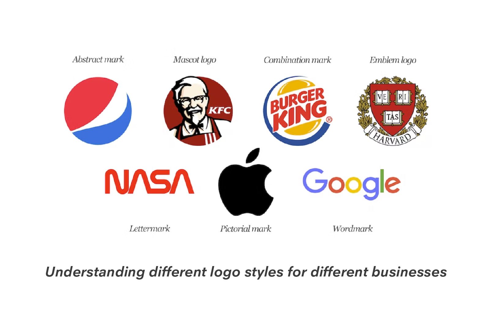
For all brands, large or small businesses, nailing down just the right logo is a crucial step in building their brand identity. It directly correlates with brands values, goals, and objectives. It is at the center of the branding strategy and serves as the face of the brand.
As a designer, if you are working to design a new logo, consider certain essential points like the brand’s core values, their products/ services, target audience, messaging style, logo style etc. Logo style is essentially the most crucial part, for there are several different logo styles to choose from and each style has its own unique significance and relevance for business and their sectors.
Also read: Amul Girl: Longest running and successful ad mascot
Let’s take a closer look at some of the most common logo styles:
Wordmark Logos
Logos made of simply just text are coined as Wordmark logos, these are known to work well for businesses that have a short and very straightforward name and need to emphasize their name recognition in the market. Their aim is also to increase brand recall, so their name and the logo style are such that they are both easy to recall and remember by their target audience, helping them to stand out in the crowd and from their competition.
Great examples of word mark logos style are logos of Google and Coca-Cola.
For over a century now, Coca-cola logo has been a household name, thanks to the ease of their recognition with their bold use of red colors, and an easy to read yet classic font style in their logo design.
Google has kept it simple, yet impactful. There are multiple colours on the logo also represent the primary colours plus a green – that is a conscious choice to help their logo stand out.
Also read: What is white space in design and why is it important
Lettermark logos
Logos that make use of a business initial are known as lettermark logos and work well for businesses that have long and complicated names, names that sometimes are too long to remember or too foreign to be understood or pronounced correctly. Lettermark logos help to simplify the branding for these brands. What these logo’s do is build a memorable and easy-to-recall name for their target audience.
Brands like HP, IBM are some great examples of how foreign names can take over the global market space in hardware software and IT sectors with their simple logo design that aids to make the brand stand out.
Luxury brands are known to use this form of design a lot. Logos for luxury fashion houses such as LV, Chanel logo, Dolce and Gabbana are a few examples.
Also read: 5 reasons to become a UI/UX designer
Pictorial logos
Who doesn’t enjoy a little symbol, emoticon or graphic?
Pictorial logos are what brings these graphics to us in the form of a logo. This logo style uses a symbol, graphic or an image to represent the business and their products. If you are designing for someone that needs an iconic image to stay with their brand for decades to come, Pictorial style of logo will help you achieve it. A unique graphic or symbol can make a brand instantly recognizable and memorable.
Think of brands like Nike – Swish logo, Apple – bitten apple, anytime you see one of their symbols, you are sure about the brand you are purchasing from. These symbols and graphics over time become key to build ad campaigns, social media and digital around.
Abstract Logos
Think of symbols that are not necessarily easily recognizable, these are shapes, colours, graphics, and symbols making a logo. This style is known as Abstract Logo. If you are designing to build a unique and original artwork as a logo for a brand, this is the style you are working with. Using abstract shapes, colours – you can offer a brand a logo that is both aesthetically and visually appealing but also distinctive.
Fine example of abstract logo design is seen with Pepsi, Adidas, and Airbnb logo designs.
Mascot logos
If you are working to build a logo design by making use of a character or an animal, this falls under the mascot logo style category. These logos have worked rather well for brands that want to create a fun and friendly image, an inviting one for their target audience. Using an animal or a character is shaping a memorable and recognizable brand identity that is also easy to recall.
Brands like KFC, McDonalds, Pringles – are known to use characters for their logos across the globe.
Also read: How symbols make your design powerful
Emblem logos
When you design a logo with vintage style text using a badge, seal, or crest – these are known as emblem logo styles. These logos use more of a cohesive image and communicate a sense of legacy, prestige and often associates a brand with a long line of history. They represent their connection to a particular place (geography/country/state), a culture, tradition, or royalty.
Think of brands like Versace, Toblerone, Paramount. They represent a part of their own place of birth and the culture around it.
While there is no set rule of designing a logo or making use of only one logo style, as a designer you will learn to play around with colours, typography, elements and more to bring out what is essential.
At Strate School of Design, study of logo design is a crucial part of the pedagogy and course structure in the Visual Communication and Brand Identity design course.
Learn design from India’s leading design school – Strate School of Design. Admission information access here.


Want to Become a Designer ?
Strate is a unique design school that nurtures your talents as a designer by offering state-of-the art designing courses in Bangalore.
Join Strate