
As a designer have you thought of making an inclusive design that embraces the senses beyond that of just sight? As a common man, have you encountered a type of design and typography style that engaged more than just your eyes?
When we look around, we are constantly surrounded by colours, smells, sights, sounds and textures. And so, when we really look at design of any kind, it cannot exist in a vacuum – design and designers should consider all sense when designing a product or service. This helps to fully connect with their audience and be more inclusive.
As individuals we all have our own set of memories and history that help to define the experiences we have with many designs/products. Sounds of children playing in a park can whisk one back to their childhood memories and childhood friends, the smell of wet mud can bring back a favourite holiday moment with loved ones. As designers, one must focus on these simple elements of nostalgia and emotional connect that go beyond just the sense of sight – but also engage our sense of smell, hearing, touch, and taste.
Type personalities
In typography, the most interesting aspect is how fonts have their own unique personalities and each different font can help evoke a different emotion itself. Typography with such creative use of fonts can offer multisensory experiences to the viewers and users. This is when a designer succeeds in creating a rich experience, a more meaningful one that holds a strong recall value.
Type designers usually use the power of languages when they build their designs, from deconstructing the letters to reassembling them with contextual shapes and sizes – an alphabet takes a whole new meaning in bringing out a new trait via typography – like it can make a viewer think of what this could taste like, feel like, sound like or smell like. They engage with type in terms of personality variants and associate qualities with the font style, colours, and sizes.
Also read: How Spotify’s wrapped became a global design sensation
Let’s explore how our senses get heightened via multi-sensory typography:
Touch
Imagine carving on a stone, gold, or silver. Etching on a painting, wall, or stones.
We have come to the digital world from an era where our ancestors have made use of caves to draw, etch and make letterform carving. This is how they had their first experience of typography – with touch. Digitization does remove the world from the touch experience widely, the designers now make use of words and their meaning to bring in the sense of touch.
Example, Hot/fire/burn suggests something we should not touch, with high temperatures and hues of yellow, red, and orange.
When designing for blind, touch is one of the most important factors that designers work with. Braille is all about touch experience and many smart technologies today are helping the blind people to also experience the shape of art, pictures and scenery via digital pads that bring the picture to life via touch.
Also interesting to read: Humanity Centric design and why it matters
Smell
Words usually fail when we try to describe a particular smell that brings in nostalgia and memories of the past to us. Many experts quote that nothing is more definingly memorable than smell. Research shows that our smells can be extraordinarily precise and yet they are close to impossible to describe to someone who has not smelled the same thing. This makes it an interesting challenge for designers to integrate smell considering our devices are more prone to sight, touch, and sound.
Some designers work by embracing the sense of smell in ways that lead a person to a certain situation. The smell of earth when it rains, the strong smell of petrol around gas stations, the rotting smell of eggs are easy examples on how designers can evoke certain emotions. When the background showcases rain touching earth with the type around this design being more earthy – it will bring in the sense of the smell of wet earth.
Also interesting to read: Trends shaping the future of automotive design
Hearing
In typography sight and sound are usually more closely linked. When you write something in bold font and ALL CAPS to send it out as a text or an email – it sounds to the other person like you are shouting, while in reality you have only written a text and they have only read it. This is the power of typography, helping users hear words based on its thickness, its size, the weight, the scale, the style of language used, the grammar and much more.
Imagine a size 60-point heavy Times New Roman vs a 8 point light Calibri. Which one do you think makes a statement appear like a headline?
Now imagine a romance quote with more white space vs one that has tiny margins and words are placed packed next to each other, which one offers a more calming experience, a quiet environment with a sense of romanticism in hearing the quote?
In this context, we get a clear understanding of the ‘psycho-acoustic’ environment (as Lehrer has called it) that engages the users/ reader to disengage from all background noise in their mind and focus on the context of the typography.
Also interesting to read: Natural Cooling- The rise of terracotta designs
Taste
Let’s imagine a summer afternoon with a font that has watermelon in its type background. What comes to your mind when you read the word summer written over a watermelon? Does the mouth not already water imagining how great it would be to get our hands on some of that sweet, juicy watermelon?
Designers play around with the properties of food that make it unique to bring the sense of taste to their typography. It can be the colours, textures, forms, and shapes – which all offer an excellent working medium to the designer. It brings on board a sense of play to bring out the deep association we all have with food.
There is also edible typography that has been used by designers to lure in more interest – especially for product marketing tactics. We have cornflakes today that are using alphabet shapes, cookies that come in snowman and Santa shapes, pancakes and cupcakes in heart shapes or alphabets with our names. Many artists use this sense of taste to evoke a certain emotion in people that brings them closer to their art and reasons behind it.
When it comes to the interaction of our senses – most of them are interlinked with each other. AR/VR technologies are aiming to bring as many senses together as possible, and designers are all in exploration and innovation mode with these emerging technologies.
Also interesting to read: Apple Electric car project: What to expect from its design
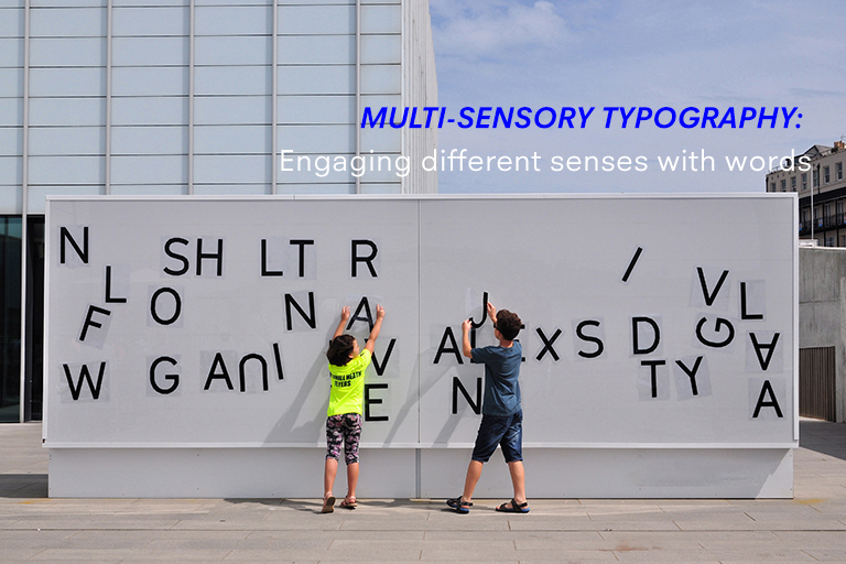
As visual and brand identity designers, one should aim to make design heard, touched, tasted and smelled as much as it is seen. Calligraphy, 3D printing, and 3D billboards and the art of installations are some ways of bringing in multi-sensory typography to play.
Want to Become a Designer ?
Strate is a unique design school that nurtures your talents as a designer by offering state-of-the art designing courses in Bangalore.
Join Strate